Tools required for silkscreen-printing on paper or fabric

--------------------------------------------------------------------------
Silkscreen Materials and Tools:
SQUEEGEES:
These squeegees are made with quality 80 durometer blade that is glued in for optimal printing and cleaning ability. Squeegees are made from the high quality polyurethane blade.
What durometer should you use?
-
60 durometer is the softest and leaves a minimal ink deposit, its great for very thin ink and water based inks.
-
70 durometer is by far the most popular and versatile in the garment industry; its a great general purpose blade for just about everything.
-
80 durometer provides a stronger force and larger deposit for thick opaque inks.
-
70/90/70 triple durometer gives you a soft edge with a hard center for optimal control.
MESH:
About screen printing mesh size: Different mesh sizes are used for different applications in the screen printing process. Mesh size is measured by how many threads of mesh there are crossing per square inch. For instance, a 110 mesh screen has 110 threads crossing per square inch. The higher the mesh count, the finer the threads and holes are in the screen.
The higher the mesh count, the finer the threads and holes are in the screen. The size of the mesh has a lot to do with how detailed your image is and how thick the ink you are using is. If you have an image with extremely high detail, a lower mesh screen won’t hold the high detail.
Your basic and most standard mesh sizes are 110 and 156. 110 mesh lays a fairly thick layer of ink down. It’s great for block text letters and larger spot color designs. It’s also a recommended mesh for white flash plates because many times you will only have to make one print impression which speeds up production time. 156 mesh also lays down a little thicker layer of screen printing ink but offers you some higher detail ability in your image due to the finer mesh. Also if you are printing with a little thinner viscosity colors of inks, you may want to use the 156 mesh so not too much ink is passed through your screen. Lower mesh counts like 40-86 are used for shimmer and glitter inks. These inks have particles in them that will not pass through the typical mesh sizes.
Therefore you need a lower mesh count with large holes in order for all the particles to pass through properly. Shimmer plastisol inks have finer particles in them so you could probably use an 86 mesh while glitter inks have much larger particles so it would be recommended to use a 40 or 60 mesh screen.
200 and 230 mesh are used for finer detailed images and thinner inks. These mesh sizes can hold larger half tone dots but are not recommended for four color process prints or fine detail half tone printing. 305 mesh is used for extremely high detail textile printing and fine halftone four color process and simulated process prints. (Learn more about process printing here.) Fine half tone dots need high fine detail mesh in order to hold and expose on. Higher meshes such as 355, 380, and 400 are used mainly for graphic printing with UV inks. UV inks are extremely thin and many times are used for high detail printing on signs, banners, or CDs.
Exposure Notes: Different mesh sizes hold different amounts of emulsion, due to how big the holes in the mesh are. For instance a 110 mesh screen will hold much more emulsion then a 305 mesh screen. While the difference isn’t extreme, you will have to vary your exposure times slightly for different mesh sizes. A finer mesh screen that holds less emulsion will expose faster then a lower mesh screen that holds more emulsion. However, the difference is small so you may have to only vary as slightly as 5-10% in either direction and depending on mesh size in order to get maximum exposure performance.
………………………………………………………………………………………………………
Screen Printing Inks
With over 50 years of producing high quality screen printing inks, Speedball fabric screen printing inks have richer colors, greater coverage, smoother workability, softer hand and easier water cleanup! Our inks will wear as long as the fabric! *ACMI AP Non-Toxic
Speedball® Screen Printing Inks:
Fabric & Paper Ink
19 Brilliant colors including fluorescent and process colors for use on cotton, polyester, blends, linen, rayon and other synthetic fibers (NOT for use on nylon). Also works great on paper and cardboard! Wash fast when properly heat-set. Non-Flammable, contains no solvents and no offensive smell. AP Non-Toxic conforms to ASTM D-4236. Can be screen printed or pained on with brush. Archival Qualities
Fluorescent Ink
Inks glow under ultraviolent (UV) light / black light and create noticeable or extra-bright color contrasts - inks look neon under UV light and fluorescent lamps.
60 durometer is the softest and leaves a minimal ink deposit, its great for very thin ink and water based inks.
70 durometer is by far the most popular and versatile in the garment industry; its a great general purpose blade for just about everything.
80 durometer provides a stronger force and larger deposit for thick opaque inks.
70/90/70 triple durometer gives you a soft edge with a hard center for optimal control.
(Speedball Opaque) Iridescent Screen Printing Ink:
Brilliant iridescent ink is opaque even on dark fabrics. Non-toxic, water-soluble inks are intermixable and tint easily. Colors dry to a rich satin texture, usually in a normal classroom period. Ink can be screened or brushed onto fabric, and is permanent when heat-set.
Opaque Fabric and Paper Inks
10 Iridescent opaque colors. Ideal for use on dark fabrics, paper or cardboard (not for use on nylon). Wash fast when properly heat-set. Non-flammable, no solvents and no offensive smell. AP non-toxic conforms to ASTM D-4236. Can be screen printed or painted on with a brush and cleans up easily with water. Archival qualities.
Phosphorescent Fabric Inks
4 Night-Glo Phosphorescent colors in 8oz. sealed jars - at night ink glows in the dark!
Permanent Acrylic Paper & Wood Inks
19 brilliant colors for use on paper, wood and cardboard. Cleans up easily with water. Non-flammable and contains no solvents. AP Non-Toxic conforms to ASTM D-4236. Can be screen printed or painted with a brush. Archival qualities.
Water Soluble Paper Inks
10 brilliant colors for use with paper and cardboard. Dries to a smooth, matte finish. Non-flammable, no solvents and no offensive smell. AP Non-Toxic conforms to ASTM D-4236. Can be screen printed on painted on with a brush. Archival Qualities
Acrylic Extender Base which is designed to create a transparent color.
Fabric/Acrylic Retarder Base slows the drying time of the inks.
Hinge Clamps Cast aluminum that is durable and rust resistant, features wide-wing thumbscrew for firm fastening to frame, positive locking for perfect registration.
http://makeitatyourlibrary.org/living/photo-emulsion-screen-printing#.VAo2R2OTH3o
Photo-emulsion Screen Printing
The general idea: After stretching fine-mesh cloth over a wooden frame, you spread a thin layer of photosensitive emulsion on the screen and let it dry. You then take a black image on transparent or translucent surface, place it against the screen, and then expose the screen to light. The light causes the emulsion to harden and bind to the fabric. Where the light strikes the screen, the emulsion will bind, making a solid layer. Where the light is blocked (ie where your black image is placed) the emulsion remains water-soluble. After exposing the screen, you spray down the screen with water, washing off the emulsion only where your image was placed; this clear area is where ink will be pressed through the screen when you print. Finally, you lay the screen on your t-shirt, other fabric, or paper, spread ink on the inside of the screen, and press the ink through the screen. If you use textile ink, you can heat-set the ink after it dries, and it'll be permanent and washable.
----------------------------------------------------------------------------------------------------------------------
----------------------------------------------------------------------------------------------------------------------
Mixed-Media Silkscreen Artists:
KEVIN SWALLOW: http://www.swallowstudios.com/mixed-media/
Erin Goodwin Guerrero: http://www.eringoodwinguerrero.com/
Robert Rauschenberg: http://www.guggenheim.org/new-york/collections/collection-online/artists/bios/1396
Thomas Wojak: http://www.thomaswojak.com/my_artwork.html
--------------------------------------------------------------------------------
Silkscreen Artists:
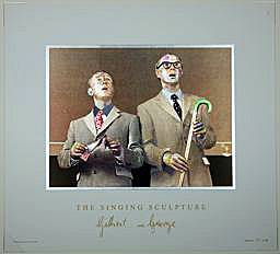
Hannah Hoch (photomontage artist), Paul Nash,Robert Rauschenberg (screenprinter), Salvador Dali, Andre BretonMax Ernst, Ronald Penrose, Ivo Medek (A Phone, 1968)Rupert Garcia, Andy Warhal, Banksy, Edward Miller, Gilbert and George (they are not silkscreenists, but their work is a good source of inspiration)
CYRCLE is a three man collective born out of Los Angeles California in 2010. The three artists who are Cyrcle come from different backgrounds of the artistic spectrum- graffiti, fine art, and design. They utilize negative and oppressive imagery to create hope and inspiration. Cyrcle’s aesthetic combines Classic Romanticism with alchemic symbolism, introducing it to the contemporary world through street campaigns, gallery work, and collaborations. These works reveal complex ideologies in their simplest forms. Living by the motto We Never Die, Cyrcle strives to shed light on otherwise dark matters, playfully exposing the gray areas of life.
Articles: CYRCLE is a three man collective born out of Los Angeles California in 2010. The three artists who are Cyrcle come from different backgrounds of the artistic spectrum- graffiti, fine art, and design. They utilize negative and oppressive imagery to create hope and inspiration. Cyrcle’s aesthetic combines Classic Romanticism with alchemic symbolism, introducing it to the contemporary world through street campaigns, gallery work, and collaborations. These works reveal complex ideologies in their simplest forms. Living by the motto We Never Die, Cyrcle strives to shed light on otherwise dark matters, playfully exposing the gray areas of life.
--------------------------------------------------------------------------------------------------------------------------
Collaboration Jean-Michel Basquiat and Andy Warhol
Collaboration in Art
Collaboration in Science and Art
Collaboration in Art/History
------------------------------------------------------------------------------------------------------------------------

Cool silkscreen posters:
Cool silkscreen posters:
--------------------------------------------------------------------------------------------------------------------------
Silkscreen Paper Stencil steps and printing on fabric


-------------------------------------------------------------------------------------------------------------------------
Painting and Drawing Techniques: Terms and Glossary
DickBlick Tutorial: Prisma Color Pencil
Chalk Pastels: techniques and terms
Water Color: Glossary
Painting (watercolor, oil, acrylic) Glossary
----------------------------------------------------------------------------------------------------------------------
Art Resource Website:
Hol Art Books: A blog that has great art links and resourceAbout Albers & ‘Bauhaus: Art As Life’
ART 21 PBS
TED Talks
NY MOMA Explore
------------------------------------------------------------------------------------------------------------
2 Artists and their works' Content:
Jean-Michel Basquiat
Jean-Michel Basquiat
Jean-Michel Basquiat
Jean-Michel_Basquiat
Basquiat used social commentary in his paintings as a "springboard to deeper truths about the individual",[2] as well as attacks on power structures and systems of racism, while his poetics were acutely political and direct in their criticism of colonialism and support for class struggle.[3]
Keith Haring
Keith haring
Pictures and Poetry: more Pieter Brueghel
-------------------------------------------------------------------------------------------------------------------------
Collage, Photo-montage techniques: Artists/Links
Richard Hamilton:
Richard William Hamilton (24 February 1922 – 13 September 2011) was a British painter and collage artist.


David Hockney:
In the 1970s, Hockney began working in photography, creating photo collages he called joiners.


Romare Beardon: on his collage process
http://youtu.be/j-0ZbWUaD-4
Collage:
the Tate Gallery's online art glossary states that collage "was first used as an artists' technique in the twentieth century."According to the Guggenheim Museum's online art glossary, collage is an artistic concept associated with the beginnings of modernism, and entails much more than the idea of gluing something onto something else. The glued-on patches which Braque and Picasso added to their canvases offered a new perspective on painting when the patches "collided with the surface plane of the painting." In this perspective, collage was part of a methodical reexamination of the relation between painting and sculpture, and these new works "gave each medium some of the characteristics of the other," according to the Guggenheim essay. Furthermore, these chopped-up bits of newspaper introduced fragments of externally referenced meaning into the collision: "References to current events, such as the war in the Balkans, and to popular culture enriched the content of their art." This juxtaposition of signifiers, "at once serious and tongue-in-cheek," was fundamental to the inspiration behind collage: "Emphasizing concept and process over end product, collage has brought the incongruous into meaningful congress with the ordinary."
Collage in painting

According to some sources, Picasso was the first to use the collage technique in oil paintings.
According to the Guggenheim Museum's
online article about collage, Braque took up the concept
of collage
itself before Picasso, applying it to charcoal drawings. Picasso adopted
collage
immediately after (and was perhaps indeed the first to use
collage in paintings, as opposed to
drawings)
Photomontage
Collage made from photographs, or parts of photographs, is called photomontage. Photomontage is the process (and result) of making a composite photograph by cutting and joining a number of other photographs. The composite picture was sometimes photographed so that the final image is converted back into a seamless photographic print.
the works of Richard Hamilton,and Romare Bearden, are some examples.
Digital collage
Digital collage is the technique of using computer tools in collage creation to encourage chance associations of disparate visual elements and the subsequent transformation of the visual results through the use of electronic media. It is commonly used in the creation of digital art.
--------------------------------------------------------------------------------------------------------------------------------------------------
Inspired by Artists and their works, and philosophy
Inside Dance: Akram Khan

William

"One of the fascinating things about William Kentridge's films is how they let the process show. Because he draws, shoots, erases and shoots again to create his imagery - rather than painting animation cells or digitally developing scenes - I am conscious of his means, even his touch. It was Kentridge's genius to show how the directness of drawing could survive the indirectness of a camera-based art."
- from "William Kentridge" by Janet Koplos, Art in America, December, 2002
How to find inspiration and how to develop ideas and content for an artwork:
• Write
down all subjects, themes, places, things, activities or issues that are
personally relevant and that matter to you (even random, unexpected
things, such as a the art room sink, or spoons and forks in your kitchen
drawer).
• The
purpose of any artwork is to communicate a message: If there is no emotion
behind the work, there is no driving force – nothing to direct and shape your
decision making. Write down the things that you care about; that move you.
• Include
topics that are unusual, challenging, controversial, gritty or inspiring: those
that fill you with passion.
Draw a chart and layout your inspirations, ideas and thoughts:

Draw a chart and layout your inspirations, ideas and thoughts:

TOP artists reveal how to find creative inspiration
• Guy
Garvey, musician: “Just start scribbling. The first draft is never your
last draft. Nothing you write is by accident.”
• Tamara
Rojo, ballet dancer: “An idea never comes to me suddenly; it sits inside me
for a while, and then emerges. When I'm preparing for a particular character, I
look for ideas about her wherever I can.”
• Susan
Philipsz, artist: “I love silence. I can't listen to music while I work and
I need to be alone. I Keep it simple.”
• Akram
Khan, dancer and choreographer:
“Find stories, I am inspired
by stories of people, of communities, of different cultures, of new history
that we are writing or forming. Mostly, I am inspired by children and their
grandparents: the way their faces dance.
Let go, The subconscious part of myself
creates far more interesting things than the conscious part can ever dream of.”
- · Polly Morgan, artist:“Don't wait for a good idea to come to you. Start by realizing an average idea – no one has to see it. If I hadn't made the works I'm ashamed of, the ones I'm proud of wouldn't exist.
Don't be afraid to scrap all your hard work
and planning and do it differently at the last minute. It's easier to hold on
to an idea because you're afraid to admit you were wrong than to let it go.”
Yayoi Kusama
http://www.youtube.com/watch?v=qjAzNDObUZ8
................................................................................................
The Unilever Series: Ai Weiwei: Sunflower Seeds: Interpretation text
http://www.tate.org.uk/whats-on/tate-modern/exhibition/unilever-series-ai-weiwei/interpretation-texthttp://www.tate.org.uk/whats-on/tate-modern/exhibition/unilever-series-ai-weiwei-sunflower-seeds
Ai Weiwei’s Sunflower Seeds challenges our first impressions: what you see is not what you see, and what you see is not what it means. The sculptural installation is made up of what appear to be millions of sunflower seed husks, apparently identical but actually unique. Although they look realistic, each seed is made out of porcelain. And far from being industrially produced, ‘readymade’ or found objects, they have been intricately hand-crafted by hundreds of skilled artisans. Poured into the interior of the Turbine Hall’s vast industrial space, the seeds form a seemingly infinite landscape. The precious nature of the material, the effort of production and the narrative and personal content make this work a powerful commentary on the human condition. The work seems to pose numerous questions. What does it mean to be an individual in today’s society? Are we insignificant or powerless unless we act together? What do our increasing desires, materialism and number mean for society, the environment and the future?... click on above links to read more
.........................................................................................................
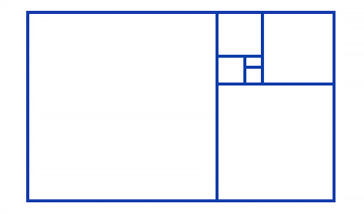
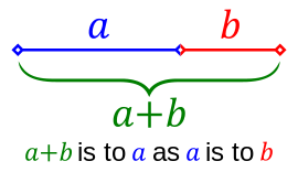
Golden Ratio:
The golden ratio in art and architecture
http://emptyeasel.com/2009/01/20/a-guide-to-the-golden-ratio-aka-golden-section-or-golden-mean-for-artists/
Wikipedia:
http://en.wikipedia.org/wiki/Golden_ratio
Golden ratio, a geometric proportion that has been theorized to be the most aesthetically pleasing to the eye and has been the root of countless mysteries over the centuries. The golden ratio describes a rectangle with a length roughly one and a half times its width. Many artists and architects have fashioned their works around this proportion.

DIGITAL ARTISTS:
http://www.digitalartrevolution.com/digitalartrevolution/Book_Artists.html
About Sketchbooks: http://museartanddesign.com/2011/03/sketchbooks-sizes/
About Paints/Acrylics:
http://willkempartschool.com/what-is-the-difference-between-artist-quality-vs-student-grade-acrylic-paints/
About Paper Weight: http://paperworks.com/about-paper-weights
No comments:
Post a Comment